I work with Red Cross Red Crescent Climate Centre as a sort of artistic interpreter: translating data, knowledge, and experiences in all kinds of ways: transforming science to be understood by communities, policy to be more useful to the public, practitioner insights to be actionable by decision-makers, and many other configurations to communication+audience! ArcGIS StoryMaps is a tool I’ve worked with extensively in recent years, alongside incredible GIS specialist colleagues. The StoryMaps tool is an accessible way to present multiple layers of information (not just maps!) and has the capacity to include art and stories in different ways.
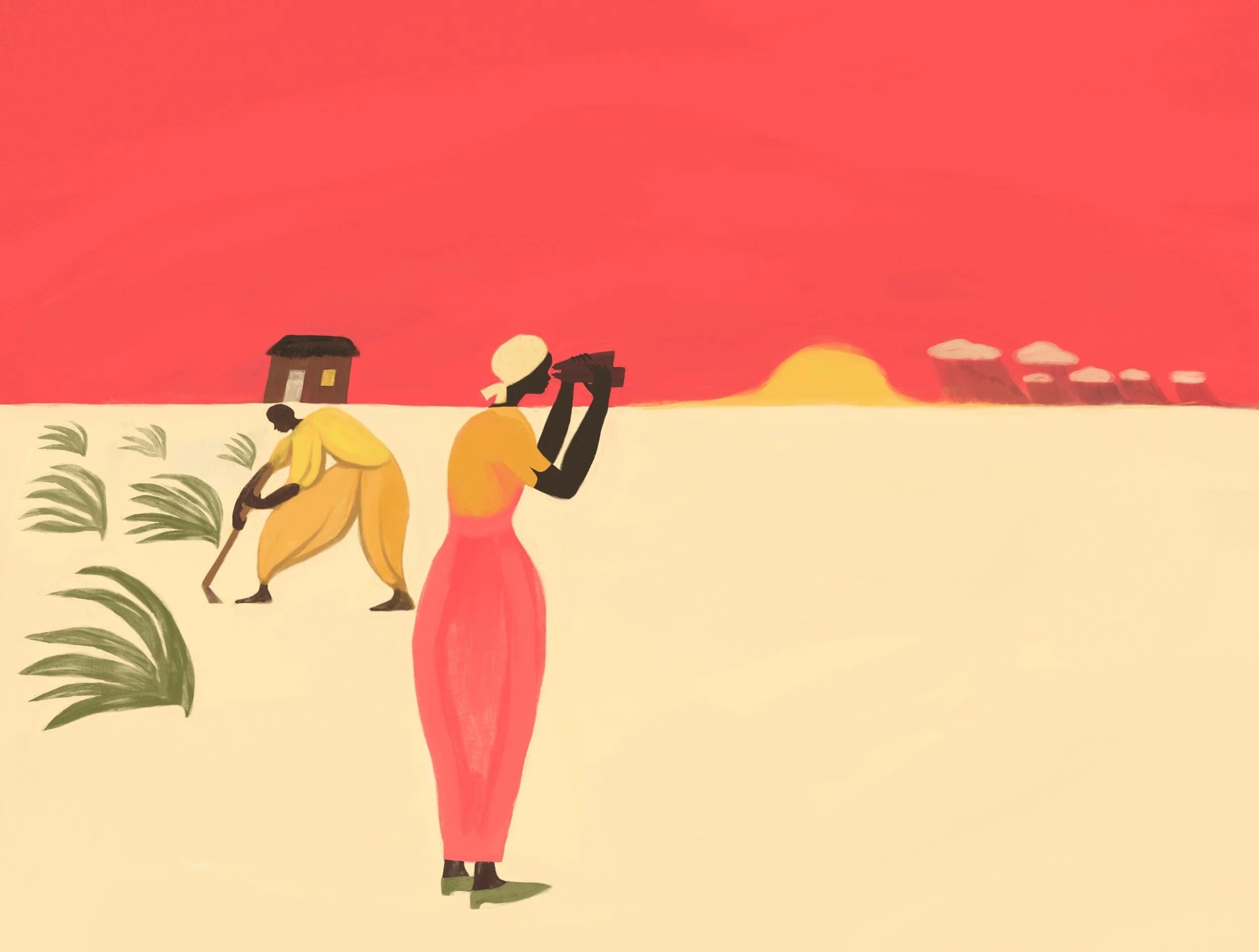
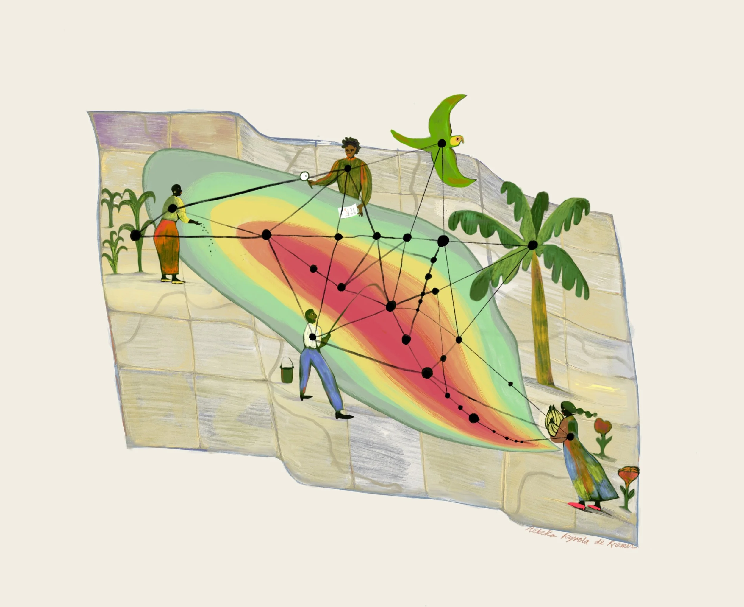
In many StoryMaps projects I’ve contributed painted illustrations, portrait art, illustrated photos, or other visuals to add an art-based component to the multimedia mix. This art is all in service the stories presented by maps and text, a way to make the communities represented there more emotionally resonant and closer.
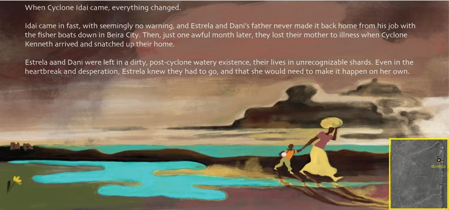
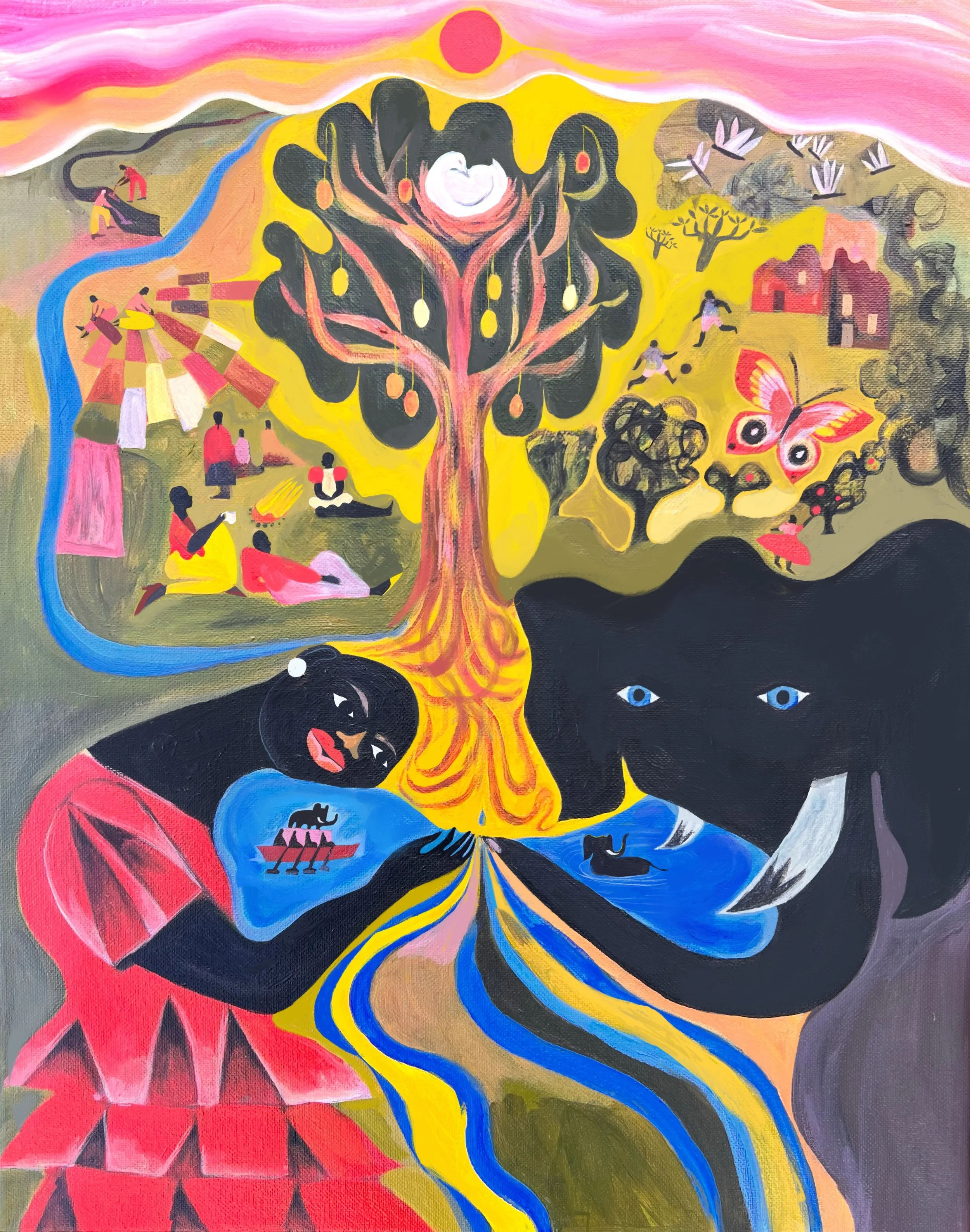
The most exciting StoryMaps have been the ones where there’s been a space to connect with people living within the contexts presented in the maps (like members of Community Emergency Response Teams (CERTS) in Lebanon) and tell stories in more creative ways (like the fictional story in the Cabo Delgado map or the speculative fiction in a map for a Zambia project).
Experimenting with StoryMaps has been invaluable in demonstrating the need for holding multiple perspectives, types of knowledge and information, and scales of seeing. More StoryMaps coming soon!
An illustration for a StoryMap for Climate risk screening of ICRC operations in Sudan (2022): A map-based complement to a screening of 73 project documents across 6 sectors.
An illustration for a StoryMap titled Honduras — Eta & Iota: Understanding compound events in fragile contexts: Retrospective compound risk analysis of two Tropical Storms.
Both above from Communities Who Care. Preparedness in Bekaa & Akkar, Lebanon: How Community Emergency Response Teams (CERTs) build resilience before, during, and after crisis.
A slide set for prepared for colleagues to introduce the StoryMap tool. Scroll through for links to StoryMaps: